We had an exciting conversation with Ilya Ostrikov, the art director of the REN TV channel, and prepared the big interview with him for your eyes.
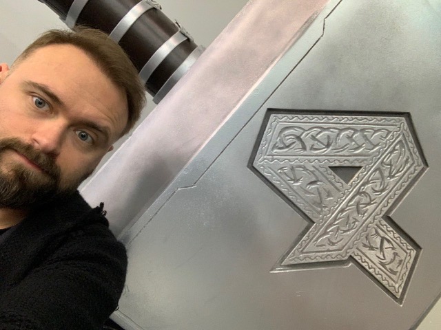
Let us start from the beginning. Tell us about your way into the profession: how you started out, where you studied, how you ended up at REN TV.
Honestly, a full story could take at least half an hour. I’ll try to tell you how I started out; I love telling about it. So, it was the year 2003. I was a high school computer science teacher at the time. My older brother Alexey once came back from work and told me, “They are launching a new TV channel and need people.” I said, “Okay, but what kind of people do they need?” He said, “They need you to know some Photoshop thing.”
I had seen Photoshop like twice in my life back then, but still answered, “No problem, I can do it.” I was thinking, “I’m a computer genius, I know everything, don’t I?” So I went downstairs to a bookshop, took the first Photoshop tutorial that I found and read it right there, because I had no money to buy it. Then I put the book back on the shelf, went home, recreated the lessons I read about, uploaded them on a floppy disk, and gave my brother. I said, “That’s my portfolio, show them.”
The next day, my brother came back, saying, “They told me it was alright and that I should bring you over,” so he basically took me there by the hand. When I looked at that portfolio a couple of months later, I was horrified and confused how they even hired me with this…
When I came, they asked, “So you know Photoshop?” I said, “Yeah, I do.” And they went, “You’ll have to learn non-linear editing, DPS Reality, DPS Velocity. Also study up on After Effects, Illustrator, and some caption tools. You’ve got one month.” Dumbfounded, I asked, “After-what?” My future boss only laughed. It turned out that they were looking to launch the Sport TV channel in a month and wanted to staff the live graphics department with the designers on a short notice.
They showed me the caption tool. “Look, you press Enter and the caption is on screen.” I yelled, “What kind of magic is that? Let me broadcast, I want to try it right now.” They gave me a weird look, “Are you okay? We are taking you in as an intern, and then we’ll see.”
Three weeks later they hired me full-time. In a year, I was the senior live graphics designer. Another year or so—and I became the department head, and in half a year they gave me the broadcast graphics department. So, I spent some four years there, starting out as a closed captioner to become a head of two graphics departments. This is how I ended up in the world of television. It’s captured me and won’t let me out ever since.
Four years down the road, I realized I needed to move on. I was young and hot-headed; I wanted to conquer new horizons. I went to work in a mobile phone content production company for a year. Back then, the content for mobile phones wasn’t so readily available as it is now. You had to send a text to receive a ring tone or a picture. We did advertising there, but a year later I wanted back on the TV. And I wanted it badly, like it was an obsession.
So I came back and started working for two channels at once, 7 TV and Muz TV, at graphics departments. Then I worked for Krasny Kvadrat for some time, and subsequently transferred to the Zvezda TV channel. After Zvezda, I worked for Channel One Russia in the news department. I was developing concepts used to embed new live graphics elements. They were further implemented using Vizrt.
After Channel One, I was invited as the live graphics department head of the Russia-24 channel. VIZART was the contractor. At the same time, I worked on the Vesti-Moscow program on the Russia-1 channel in the same capacity. So I had to work for two channels at once.
After that, they asked me to join the Moscow 24 channel as the head of the live graphics department. All this time I also taught the motion design course and was a curator at the Scream School, a school of computer graphics. There was also British Higher School of Design, where I taught animation as part of the Visual Communications course by Leonid Slavin, and also the editing department of the Moscow School of Cinema. Besides, I taught a short course to journalism majors at the Moscow State University.
The second time I left television for a while was after Moscow 24, when I worked as an art director in advertising production for a year, and then I was briefly in the employ of the Radugadesign company as a production director. This is a great well-known studio; they deal with events and shows. After that, I was invited to REN TV as an art director. I had already acted as an art director for the previous four years on television; it just was called a little differently. We supported the broadcasts of Moscow 24, Russia 24; not only we did the live and news graphics, but also a lot of general design tasks as well. They just didn’t have an art director as a separate capacity, so the position was called a chief designer with the functions of an art director.
Now I work as an art director at the REN TV channel.
Do you have favourites amongst the channels you worked at?
My favourite channel is the one where I work: when jumping from one channel to another, I learned something new every time. For example, at Sport, I was taught how to deal with graphics, I was taught responsibility, and not just a job-related one, but responsibility to the broadcast and to the viewer. Live graphics are what you need here and now, not five minutes later, when the broadcast is over.
Channel One taught me to do concept design. VGTRK taught me personnel management, typography, diligence, tricks, subtleties and aesthetics of design, that is, polished me. This was done by the people who surrounded me.
REN TV taught me to be tough, not to do trendy things, but to do what is relevant to a particular viewer. Overall, every place where I worked was an educational process.
All channels are my favourites, but the first one I worked on, Sport, I still value the most, because it was an excellent entrance to the industry. It showed me that there is a lot that happens behind the scenes beyond what we see on the screen. The inner workings are so magical that they still won’t let me go.
How many people do you interact with on REN TV now, what is your team and what tasks do you usually have?
When it comes to the design department, I work with 12 people now. This includes digital design, printing, broadcast, as well as the manager and the producer, who are crucial for the process.
There is also a fairly large promo department, with which we work very closely. We all ensure product promotion, that is, we perform a marketing function. We all pack content, because television exists for the sake of its content, and we help promote it.
What difficulties do you usually face when working on projects? What’s the hardest part?
The hardest part is neither creating the graphics, nor organizing the process, nor finding people. All these processes have been successfully established for a long time, they worked before me, they will work and after me—and are also working with me, of course. The most difficult thing is to meet the marketing objective, because the designer always wants to go into modern trends, and they, as a rule, come with a new tool. They make some new software, a plugin, a trendy render, and you start to follow the lead of the technology. We always forget that we must be relevant to the marketing objective at hand. That is, we cannot do something other than what we were asked to do. We must also be aligned with the brand, that is, remember that the channel’s recognition, like any other multimedia brand, is ensured by obvious sets of elements: colour, shape of a recognizable logo, dynamics.
You need to be recognizable and, most importantly, be in line with the target audience. If you make it picture-perfect, trendy, and cool, in no way it will guarantee a success, because the viewer might not understand it; and we work for the viewer first and foremost. Therefore, I often have to stop myself and remind the employees that we have limitations. Otherwise, we might not only make us less recognizable; we can visually become a different TV channel, which is unacceptable. Since we are all competing and fighting for the viewer, it should be clear to the viewer which TV channel they are watching, regardless of whether they see a logo on screen or not. And this concerns not only the content, but also the packaging. So the most difficult part is to limit your imagination with a marketing objective.
I think you gave a similar presentation at the CG Event in winter and talked about branding.
I often give similar presentations, because the sites are different, but their objective is approximately the same, to tell about design; and design only works in line with marketing.
Someone asked me once, “Is design art or marketing?” My answer was, it is the sort of art that services marketing.
Over the last year of my work on REN TV, we tried to change the format of the graphics, and I think we succeeded. The previous art director did a huge, unique, very good job, and the channel was indeed very recognizable in terms of design, but I thought it was a bit too trendy. I wanted to get away from the trendiness a little and turn around to face the viewer.
We made the format more rigid, moved from simple visual solutions to meaningful ones. REN TV markets itself as a blockbuster TV channel: if you turn it on in the evening, at eight o’clock, you will see an amazing selection of great movies and TV shows. Therefore, we adopted the visual language of films and transferred it to the design, to make it correspond to the content.
The channel was still recognizable, it was still REN TV, with the same colours and shapes, but the language has changed. I think this was a good step towards reinventing the channel, and I must say it was not my decision. Deputy Director General, Mikhail A. Tukmachev, suggested that we do it like this. We did it and I believe it turned out really well.
You organized the broadcast of the match of Emelianenko vs. Koklyaev, and it was a huge success. Please tell us about this part of the work.
This was a good case. I will not go into details and numbers, but we really landed on top of the ranking by TV viewing at some point, and this was an absolute win both in terms of internal numbers and among competitors. We were off the scale.
It was a colossal event; it was actively promoted not only on TV, but also among our partners. The channel used outdoor ads, various media facade installations, which we rarely do. The event was advertised for a very long and painful time.
REN TV used to broadcast sports events, but that was ancient history. Essentially, the channel rediscovered the area. Besides, this fight wasn’t aired as a sports event. Serious sports mostly attract male audiences, but shows attract a much wider audience. Since the channel approached this not as a sports event, but as a grand show, we managed to attract such a large viewership.
This required a colossal amount of graphics. First of all, the design of the broadcast itself, a standard set: headers, jingles, a promo package with packshots, captions, and filming. Since this was partly a sports broadcast, we made sports graphics, like countdowns, credits, and profiles for a television broadcast. My work on the Sport TV channel gave me the right experience and the opportunity to operate the right categories.
When we started producing graphics, we knew what we were doing. Besides, my manager Sergei Sochin was also familiar with the specifics of sports broadcasts and was even savvier than I in this matter. Thus, we managed to make good sports graphics in the broadcast. Of course, before the broadcast, we designed the entire promotional package together with the promo department. We filmed, drew concepts, approved; we had several design ideas. And one of them was on air.
We did outdoor advertising, souvenirs, digital advertising, a promo website—a small landing page. We did photography, video filming, design of the arena, roll-ups, interview areas and photo areas inside the stadium. We also made the graphics for the stadium together with our partners. Stage graphics is a non-core job for a TV channel. Thankfully, I had experience working for the Radugadesign company, which deals with show graphics. There were non-standard surfaces with non-standard resolutions: a screen in the centre of the stadium above the arena with four square surfaces, two rings and side surfaces, a line along the perimeter of the stadium with a huge resolution, almost 32 thousand pixels. Nobody makes these graphics on television; this is a job for dedicated studios. However, since I’m greedy for graphics, I had experience, and I wanted to do it in-house, we did everything ourselves.
Clearly we succeeded in some ways, but there were areas where we fell short. Overall, the picture turned out very attractive though, and this was really an unusual case for a TV channel. However, the graphics did not work here as an independent unit. The main thing here was the show. The graphics helped pack it all up, but it was just a small part of a larger project implemented by a huge number of people.
How long did the preparation take?
I’m not exactly sure, but it took about three months. Thank God, we launched Cerebro back then; we completed about two hundred graphics tasks.
How did the team react to Cerebro? How did you implement it in the company? Was it hard to get used to?
Any process that begins to crystallize a structure is very difficult to accept, because structuring a process is when you start to restrict yourself with some boundaries. Previously, someone sent emails, someone messaged in WhatsApp, someone asked you to come up for a discussion, and then there is suddenly a rule. And it does not correspond to everyone’s idea of how it should be. So, any structuring process is a process of formalizing rules, and rules are a lack of freedom. Someone says, “Oh, cool. Finally,” because they used to work with Cerebro. Someone asks, “What is it exactly?”
I got to know Cerebro as closely as possible in advertising production and learned the structure there. Before that, forever ago, we used some sort of spreadsheets, or Bitrix; there were many different management tools, from the simplest to the most sophisticated, but hardly any of them were adapted to working with video and graphics. And here everything is done in such a way that you manage to establish internal processes.
It took me two or three months to build the structuring process with the help of Cerebro, because, first of all, you need to formulate rules for employees and yourself, not to violate them, and make sure that others do not. Some people stick to the old habits even now, but I am going to force the change, and the process will be built.
Clients say that most of the time is spent fighting with colleagues.
I have an administrative leverage, so I tend to win this fight.
Have you ever managed to combine creativity, your concept, and marketing style? Was any compromise reached? Or do you follow the guidelines strictly?
Even though we service the marketing, we are still creative. We can develop something very beautiful, I bring it to the management, and they say, “No, it won’t work.” I do not in any way take this as a criticism of me or my employees design-wise. I take this as an indication that we have got a little carried away and we need to make the graphics just as beautiful, but also meet marketing objectives. This does not mean we did it badly, but rather that we need to do it as beautifully, but in a different way.
Here’s an example from recent experience. We are now finishing work on the new REN TV season and have done the design of one of the program headers. It turned out quite well in terms of rendering, composition, dynamics, colours, meanings, but we got carried away and received a comment that it was too simple and incomprehensible (because we hid the idea behind the design). Our problem is that when we play around with the software, we forget about the meaning. We are fighting for pixels, but we must fight for significance.
So, when they told us this wouldn’t work, I was a little upset at first, because I thought we did a good job. Then I calmed down a bit, drew two more concepts, showed the management, and one of them was approved. We very quickly made a new splash screen for the program using simple tools, without super-complex 3D renders, animations, and modeling, and it took a week. And they told us, “Why didn’t you do the same thing right away?”
I believe we shouldn’t fight the marketers, but listen to them, because design is not a thing in itself. We have to solve a common problem. You just need to make it just as beautiful, but also meaningful. That’s all.
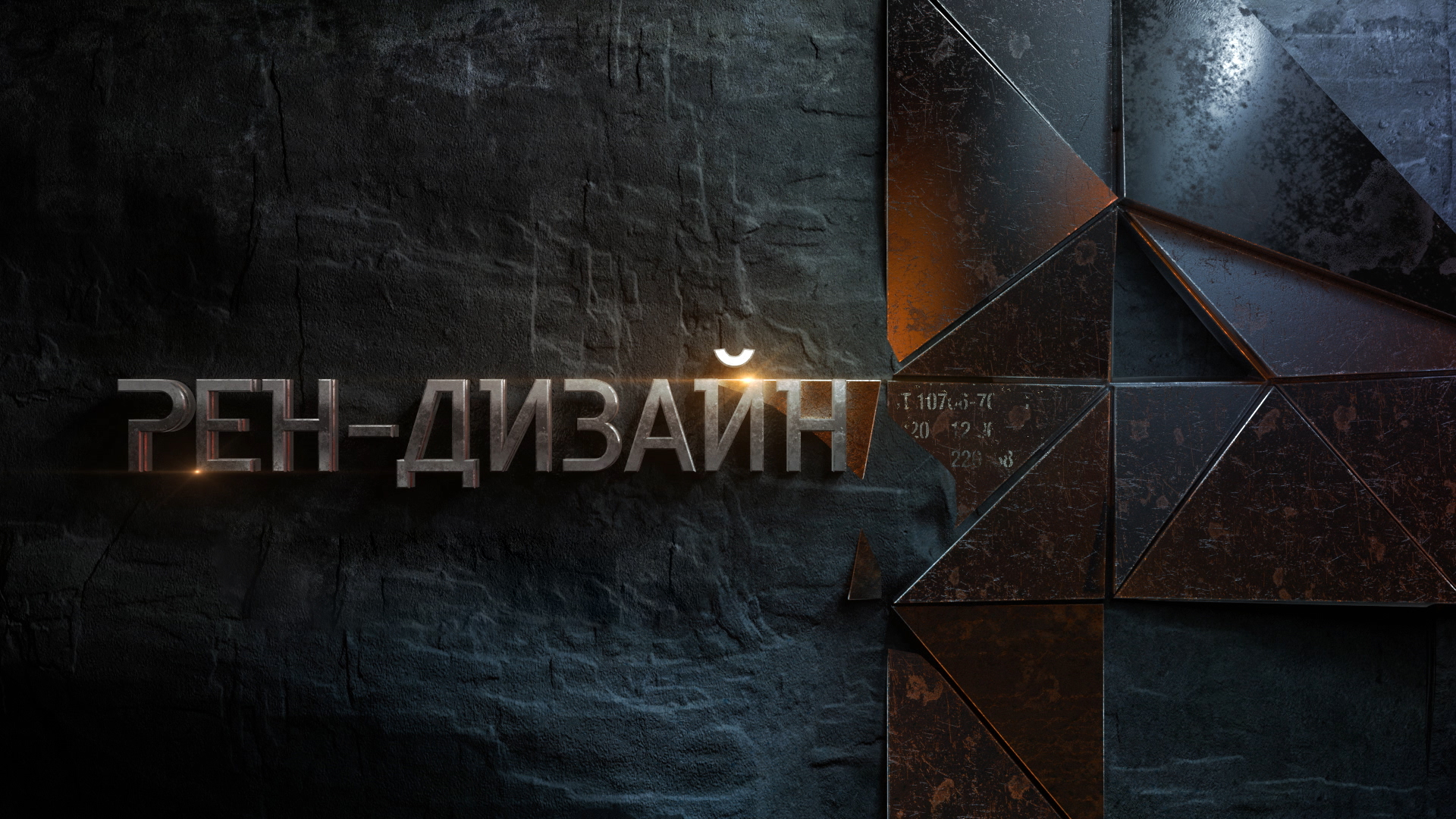
Could you give me an example of a scene that required a lot of technical work, but looked very simple on screen?
There are two aspects. Firstly, I’ve had a professional deformation for a long time, and everything I see I tend to estimate as quite simple. Despite the complexity of the effects, the mise-en-scène, the composition, I still see how it is done and, in my opinion, it’s simple, no matter how cool it looks.
Secondly, it consistently happens that even if my team did an excellent job, I look at the result after a while and realize it could have been better. This is perfectionism, but there is no limit to perfection, you always want to make it more interesting, to fight for pixels.
How much has your attitude to work changed since you started? Do you manage to get some rest? Do you have burnouts?
For me, television broadcast is a deity, and I respect it immensely, because I respect the viewer, first of all. Therefore, I try to maintain the same attitude to my work. For me, it is still very important, so much responsibility. My friends call me a worrywart because I am constantly fretting about the product we make. I thought I was calm as can be, but they say, “No, you still worry all the time.”
As for the time off, it’s very trivial. I stopped working from home: I no longer do graphics at home, I don’t take freelance projects. I realized that home is a place where you have a rest, so I leave all work at the door. I do own a computer at home, but it rather serves as a media player. I have a work laptop, so I can only respond to critical emails.
I do work overtime if needed, for example, during the preparations for the new television season. This year, the season starts a little earlier on our channel than on the others: usually it is September, and we start two weeks earlier. That’s why we now have very strict deadlines, there is a lot of work.
Advertising production taught me how to work round the clock for several days in a row. Sometimes I wouldn’t get any sleep for three days—this is normal in the industry. We worked a lot and did overtime. Of course I get tired, I’m a human being, but the work needs to be done. As I said above, no one needs your graphics after the broadcast, so you need to work right now. We’ll start the season, I’ll take a vacation, get some rest, return to a more steady rhythm, and everything will be fine. In the meantime, my duties do not give me the opportunity to work less than 12 hours a day, seven days a week.
Do you need to get inspiration somewhere? Or do you need it in the first place?
Inspiration is an interesting thing. Many years ago, my friend studied to be a designer, and when she and her groupmates said that they could not draw because they needed an inspiration, the teachers replied, “What inspiration? Just work! You are designers!”
I’ve never known how to be inspired. Some people go, “The wind blew, the birds chirped, the leaves rustled in the trees, and that inspired me so! I watched a movie, read a book, saw a work of art and now I’m inspired.” No. It doesn’t work that way for me.
When you start your career, you steal ideas, you can’t help it, but after a while you start to operate with the concepts you’ve yourself developed.
When solving a problem, I can sometimes spend days surfing Behance and Pinterest in search of a reference and never find anything that would inspire me to start a new task. Then I leave the office, and come back two minutes later and say, “That’s it, I know how to do it.” It just comes to mind somehow. Sometimes I wake up at night, “Oh, so this is how it should be done.” Because your brain keeps analyzing it in the background, looking for a solution in the mind palace. God knows why, but my brain sometimes plays this game with me, it throws me solutions, and they turn out surprisingly successful.
I think this is pure luck, others say this is professionalism. The most important thing is to keep this solution, formulate it, convey it to the contractors and say, “Do it like this, and it will work perfectly.” This is why I don’t know what inspiration is. I call it luck multiplied by experience.
Do you have any favourite films that you like to rewatch?
As a child, I was madly in love with Luc Besson’s The Fifth Element; I watched it every evening for like two months. I may sound a bit pedestrian, but Perfume: The Story of a Murderer left me speechless. The book was less delightful for me, but the film I watched with great pleasure.
I really like Zakharov’s films The Formula of Love, To Kill a Dragon. I enjoy watching The Pokrovsky Gates and The Heart of a Dog. I liked Adam’s Apples a lot. The Favourite of 2018 is an excellent movie with an excellent camera work. I liked El Angel of the same year, produced by Argentina and Spain.
Spirited Away is a stunning animated feature. I liked Climax and The Professor very much. Three Billboards Outside Ebbing, Missouri is also a very good film. But The Fifth Element is still the best to me.
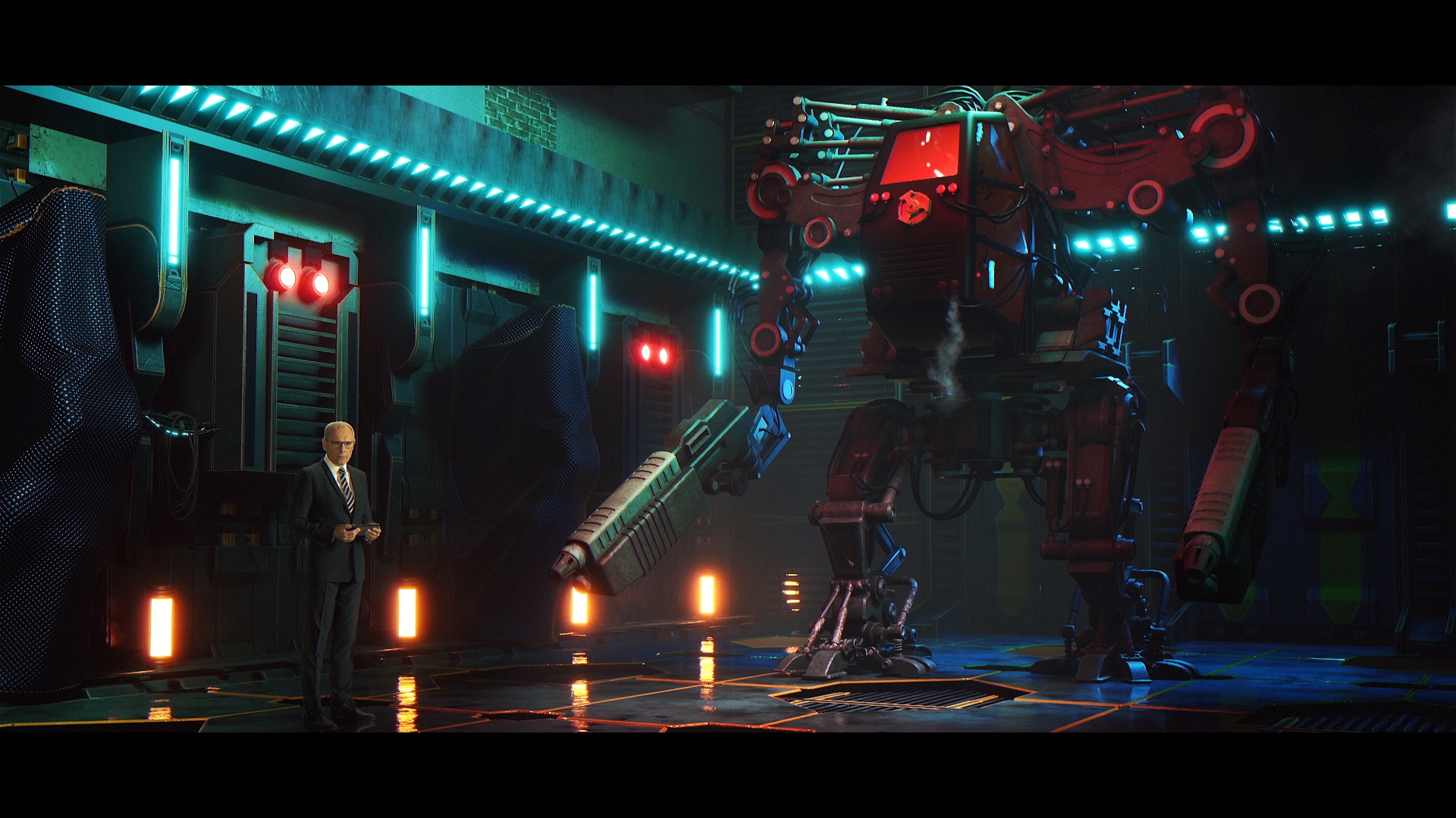
You wrote about a Russian horror film Yaga. Do you think the horror genre in the country is moving towards improvement?
I will say it only as a viewer, because who am I to judge cinema in terms of artistic value, acting, camera work, and director’s work? As a viewer, I liked Yaga. I noted that children act well there. Unfortunately, this cannot be said about adult actors.
There have been attempts to film something similar based on folk motives, but not everyone has succeeded so far. Though it seems to me that Russian literature (the Strugatsky brothers, or Lukyanenko for instance) could look spectacular on big screens. We have a lot of interesting things to film. I would like to see Max Frei’s Labyrinths of Echo, for example.
Let us talk about Cerebro. I would like to ask about your experience with it. What feature do you use more often, what less? What do you like more, what less?
I’ll start with a drawback. I have a feeling that this software is bloated; there are too many functions, and not all of them are intuitive. Cerebro does provide the functionality I need, but it seems redundant, heavy and unwieldy to me. I wouldn’t say that we use Cerebro all that extensively; we do very simple things: we set tasks, post all the versions of graphics that we make. I comment on them every day, I draw something in Mirada from time to time to show what I like or dislike, what needs to be redone. This functionality is enough for me in my daily work. I do not track statistics because we do not need to report our working time. I don’t use Gantt charts, because we never have more than a dozen projects underway at the same time, and they are more or less clear in terms of schedules. Sometimes I set critical tasks, check reports, check previews, send them for approval. So, the entirety of our internal communications happens in the same software, which is cool, because you only need to set a task, describe the project passport, leave references and input data, inform what needs to be sent for rework, or for voice over, or for approval. It’s a handy communicator, but we don’t go any deeper. There is no such need.
What about the Mirada player? Do you find versioning, sharing files, uploading comments useful? Do you often use audio and visual comments?
We use the audio. As for visual commenting, I only use it from time to time, not too often. I leave comments about specific time codes, but nothing more than that. I actually noticed an issue: apparently, due to the different resolution of the monitor screens, the visual comments that you draw over the picture get offset. When I draw in one scale and then open the result, the picture and the video are scaled differently. I haven’t written about this problem, not because I’m lazy, but because we don’t use it that often.
We now have a web version. Have you already seen or used it?
I haven’t got my hands on the latest web version yet. Forever ago, I had a version on my mobile, but it didn’t suit me very well: I could not see all video materials on the server, there was no access from the phone. And this thing kept sending notifications, and when there were a lot of tasks, I would get a ton. It was a little annoying. All in all, I find most messengers annoying, because people do message me a lot, and when I’m immersed in work, I don’t really like to be distracted. So I had to remove the app from my phone. Also I haven’t managed to get down to the web version yet. Do you know why? The answer is very simple. I forgot my Cerebro password. But I will definitely take a look a little later.
The last question: what could you suggest we do about Cerebro? What would you like to add or change?
Hard to say. Maybe add presets for work spaces. For example, a preset for filmmakers, another one for classical animators, etc. Like in After Effects, where you can open the animation panel, the text panel. There’s also work space. You open the minimal view, so you only have the timeline and the viewer. I don’t know how relevant it would be, but I would like to have pre-configured work spaces. And an internal chat with the team would be nice.
